
You have 8 seconds.
That’s it. That’s all the time you have before a potential client clicks the back button and hires your competitor.
In the coaching industry, your landing page is not just a website; it is your full-time salesperson. It works while you sleep, while you coach, and while you sip your morning coffee. But here is the hard truth that separates six-figure coaches from those who are struggling to fill their calendars:
Traffic is expensive. Attention is scarce. But a High Converting Landing Page? That is an asset that pays dividends forever.
If you are driving potential clients from LinkedIn, Instagram, or Google Ads to a page that looks amateurish, loads slowly, or confuses them, you aren’t just losing a visitor. You are burning money.
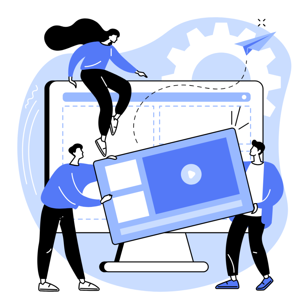
Welcome to the definitive guide on the anatomy of a High Converting Landing Page for coaches. This week, I will be dissecting every single element, from the headline to the footer, so you can finally turn your website into the profit center it was always meant to be.
But first;
Why Do Most Coaching Landing Pages Fail (The “Me Too” Trap)

Before we build the perfect page, we have to diagnose why most fail.
I have reviewed hundreds of coaching landing pages and all I can say is…
The problem is rarely the coach’s credentials. The problem is always the message.
Here’s the thing;
Most coaches write their landing pages to impress other coaches. They use jargon like “holistic synergy” and “transformational paradigm shifts.” But your ideal client doesn’t care about your methodology. They care about their migraine.
The truth is;
A High Converting Landing Page doesn’t brag about the coach; it articulates the problem of the client.
If your page is talking about “how you started coaching after a corporate career,” you are losing them.
If your page is talking about “the exact pain they feel every Monday morning,” you are winning them.
With that said, let’s dissect the anatomy of a winning landing page.
1. The Headline: The “So Me” Moment
The headline is the first 3 to 5 seconds of your 8-second window. If you fail here, nothing else matters.
The goal of a headline is not to explain what you do. The goal is to get the reader to say, “That’s me. That’s my problem.”
To explain this further, let’s look at this example…
- The Weak Headline: “Empowering Leaders to Reach Their Full Potential.”
- Why it fails: It’s vague, overused, and focuses on the coach’s actions (empowering).
- The High Converting Headline: “Stop Dreading Monday Mornings. Finally Find Clarity in Your Leadership.”
- Why it works: It calls out a specific pain (dread) and promises a specific relief (clarity).
The Formula:
[Trigger the Pain] + [Hint at the Solution] = A Headline That Hooks.
2. The Sub-Headline: The Bridge of Credibility
The headline gets the nod. The sub-headline builds the bridge. This is where you introduce yourself as the guide who can cross that bridge with them.
In 1-2 sentences, you must establish:
- Who you help: (e.g., “For burnt-out executives…”)
- What you help them do: (e.g., “…who want to reclaim their time…”)
- The mechanism: (e.g., “…without quitting their job.”)
Get this:
Never use the sub-headline to repeat the headline. Use it to add context and urgency.
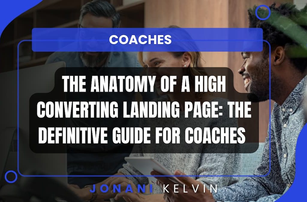
3. The Hero Visual: The Trust Fall
You are a coach. Your product is you. Therefore, your hero image (the big image at the top of the page) cannot be a generic stock photo of a person laughing at a salad.
On a High Converting Landing Page for coaches, the hero image must feature YOU.
- Eye Contact: Look directly at the camera. You need to connect through the screen.
- Context: Show yourself coaching, speaking on stage, or in an environment that reflects your brand.
- Quality: If it’s blurry or poorly lit, you look like an amateur. Invest in professional photography.
Alternatively;
If you are shy, a high-quality “Branded Background” with your logo and a powerful value proposition can work but a human face almost always converts better for service-based businesses.
4. The Value Proposition: The “What’s In It For Me” Section
Once they trust you visually, they need the facts. This is where you lay out the transformation in bullet points.
Do not write paragraphs. Write short sentences that contain easily digestible benefits.
Let me illustrate;
Bad List:
- “Learn leadership skills.”
- “Understand your emotional intelligence.”
- “Improve team dynamics.”
High Converting List:
- ✅ Regain 10 hours a week by delegating like a pro.
- ✅ Make the tough calls without second-guessing yourself.
- ✅ Build a team that actually likes each other (and works harder because of it).
Notice the difference?
The second list describes the result. It paints a picture of a better life. That is what sells.
5. Social Proof: The “If It Worked For Them…” Factor
You can say you are the best coach in the world, but it means nothing. When a stranger says you are the best coach in the world, it means everything.
Your landing page needs a dedicated section for social proof. This is non-negotiable.
For a High Converting Landing Page, you need three types of proof:
- The Logo Wall: If you’ve worked with recognizable brands, put their logos here. It builds authority instantly.
- The Testimonial: Not just “Jane was great!” but a result-oriented testimonial.
- Bad: “I loved working with John. He’s great.”
- Good: “John helped me double my team’s productivity in 3 months. I finally have my evenings back.” – Jane Doe, CEO of X
- The Data Point: If you have aggregate data, use it. “My clients have increased their revenue by an average of $50k.” This is where web tracking and data visualization becomes your secret weapon. A simple, well-designed chart showing client progress can convert a skeptic into a buyer.
6. The “How It Works” Section: De-Risking the Process
Coaching can feel intangible to a new client. They are scared. They are wondering:
- “Will I have to do homework?”
- “Is this just talking about my feelings for an hour?”
- “How long until I see results?”
Your “How It Works” section answers these questions before they ask them.
Make it simple. Make it scannable.
- Step 1: The Discovery Call (We talk about your goals).
- Step 2: The Deep Dive (We analyze your habits and blocks).
- Step 3: The Transformation (We meet weekly/bi-weekly to implement and grow).
Use icons or simple graphics (part of your brand identity) to make this section visually appealing. It de-risks the investment and makes the process feel tangible and safe.
7. The Bio: The “Who Am I” Connection
People buy coaching from people they like, trust, and see themselves in. Your bio section is not your LinkedIn “About” section copy-pasted. It is a strategic tool to build rapport.
Structure your bio for conversion:
- The Credibility: “I’ve spent 10 years as a therapist/executive…”
- The Relatability: “I started coaching because I, too, felt stuck in the corporate hamster wheel…”
- The Bridge: “Now, I use those lessons to help you skip the 10 years of struggle and get straight to the freedom.”
But that’s not all;
Use a high-quality photo of you here, preferably candid and warm. This section is about the human connection.

8. The Offer: Clarity is King
Here is where most coaches stumble. They have multiple offers, multiple price points, and multiple “Book Now” buttons.
A High Converting Landing Page usually has one goal. It is asking the visitor to do ONE thing.
- Is this page for your 1:1 coaching? (Then don’t mention the group program).
- Is this page for your ebook? (Then don’t mention your Mastermind).
If you confuse, you lose.
Clearly state:
- What they get: (e.g., “12 x 60-minute 1:1 sessions.”)
- The bonus: (e.g., “WhatsApp support between sessions.”)
- The guarantee: (e.g., “If you don’t feel more confident after 30 days, we extend the program for free.”)
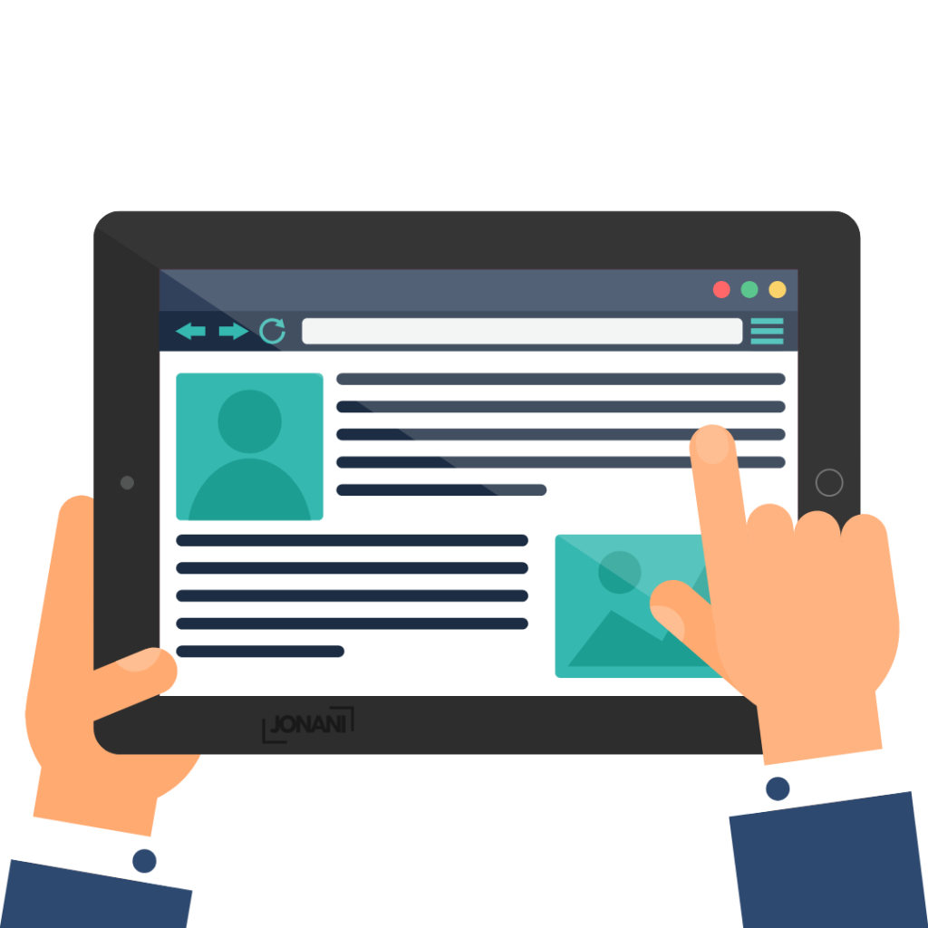
9. The Call to Action (CTA): The Ask
You have warmed them up. You have built trust. You have shown them the path. Now, you must tell them exactly what to do.
The Button Text Matters.
- Weak: “Submit” or “Click Here.”
- Strong: “Book My Free Strategy Call” or “Apply for Coaching” or “Let’s Talk.”
Make the button a contrasting color. If your brand identity uses calm blues, make the button a sunset orange or a deep green. It needs to pop. It needs to be impossible to miss.
Based on my experience over time;
Have the CTA button appear twice. Once “above the fold” (near the top) for the impulsive visitors, and once near the bottom for the researchers who read the whole page.
10. The Footer: The Safety Net
Never let them get lost. The footer is your safety net.
Include:
- Quick links to your main pages.
- Your contact email.
- Link to your LinkedIn profile.
- A copyright notice.
But most importantly, include a small recap of your value proposition or a link to your booking calendar. Even at the very bottom of the page, you should be selling.
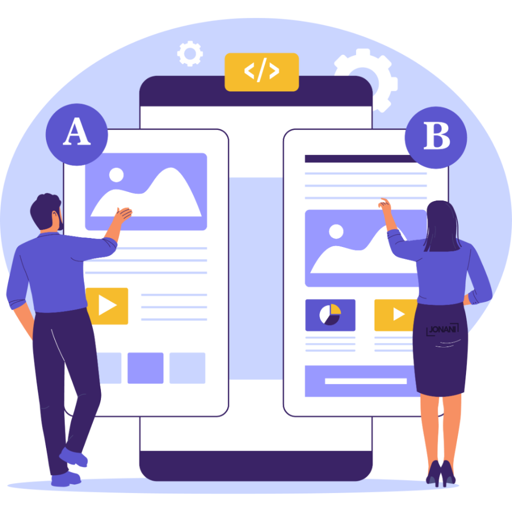
Technical Anatomy: The Stuff You Can’t See (But Google Can)
A beautiful page that loads in 10 seconds is useless. In the world of SEO and user experience, speed is a conversion killer.
Some of the critical technical factors of a High Converting Landing Page include:
- Mobile Optimization: Over 70% of your traffic will come from a phone. If the text is tiny or the buttons are hard to click, they leave.
- Load Speed: Use tools like Google PageSpeed Insights. If your page takes longer than 3 seconds to load, you are losing half your visitors.
- Tracking (Pixels): You must have tracking installed. This is where web tracking and data visualization comes into play. You need to know:
- Where are my visitors coming from? (LinkedIn? Google? Direct?)
- What are they clicking on?
- Where are they dropping off?
Without this data, you are flying blind.
The “Landing Page Audit”: Does Yours Pass the Test?
Before you publish or pay for ads, run your current landing page through this 60-second audit.
- The Clarity Test: Can a stranger understand what you do in 5 seconds? (Yes/No)
- The Trust Test: Does the page feature real photos of you and real testimonials? (Yes/No)
- The Urgency Test: Is there a clear reason to book now, or can they “come back later”? (Hint: “Later” never comes).
- The Action Test: Is the “Book a Call” button impossible to miss? (Yes/No)
All Said…
Your Coaching Business Deserves Better
You have spent years honing your craft. You have the ability to change lives. But if your digital storefront – your landing page – is letting you down, you are doing a disservice to both yourself and the clients who need you.
A High Converting Landing Page is the intersection of art (copywriting/design) and science (SEO/data/UX).
It requires:
- A deep understanding of your client’s psychology (which you have).
- A technical understanding of web design and conversion optimization (which is my job).
By combining your coaching expertise with a technically flawless, beautifully designed landing page, you create a machine that attracts, converts, and retains high-ticket clients. Stop sending traffic to a page that leaks.
Ready to Build a Landing Page That Actually Converts?
If you are tired of tweaking your own website and ready to have a professional asset that works for you, let’s talk.
I specialize in building High Converting Landing Pages for coaches that are optimized for SEO, branded to perfection, and tracked for success. Click Here to Book a FREE Discovery call. Meet you on the other end